


Punchline: Unlike most central banks, the Fed must balance inflation and unemployment. This post shows a simple way to assess its performance—and finds that the economy is moving closer to its target for both.
Most central banks operate under hierarchical mandates, with low and stable inflation as their primary objective. Only once that goal is achieved can they pursue secondary aims, such as supporting employment or output growth.
The European Central Bank (ECB) provides a clear example of such a structure. Article 127 of the Treaty on the Functioning of the European Union states:
“The primary objective of the European System of Central Banks shall be to maintain price stability. Without prejudice to the objective of price stability, the ESCB shall support the general economic policies in the Union.”
In these cases, central bank performance is typically assessed by how closely inflation tracks the target. The US Federal Reserve, however, is different. It operates under a dual mandate that gives equal weight to price stability and maximum employment. This makes performance evaluation inherently more complex: one must assess outcomes in both inflation and unemployment simultaneously.
One common way to visualise this challenge is to plot inflation on the vertical axis and unemployment on the horizontal. The Fed’s target for core PCE inflation is 2%. While it does not set a formal target for unemployment, the median of FOMC participants’ longer-run projections—currently 4.2%—serves as a practical benchmark.1 These two values define what is often referred to as a “bliss point”—the point at which inflation and unemployment both are at their targets.
Of course, the real world is more turbulent. Various shocks—financial, supply-side, geopolitical—push inflation and unemployment away from this ideal. The task of monetary policy is to navigate these disturbances and steer the economy back toward the bliss point.
The diagram below illustrates this concept. The bliss point is shown alongside the position of the economy following a hypothetical stagflationary shock—one that simultaneously pushes inflation and unemployment higher.
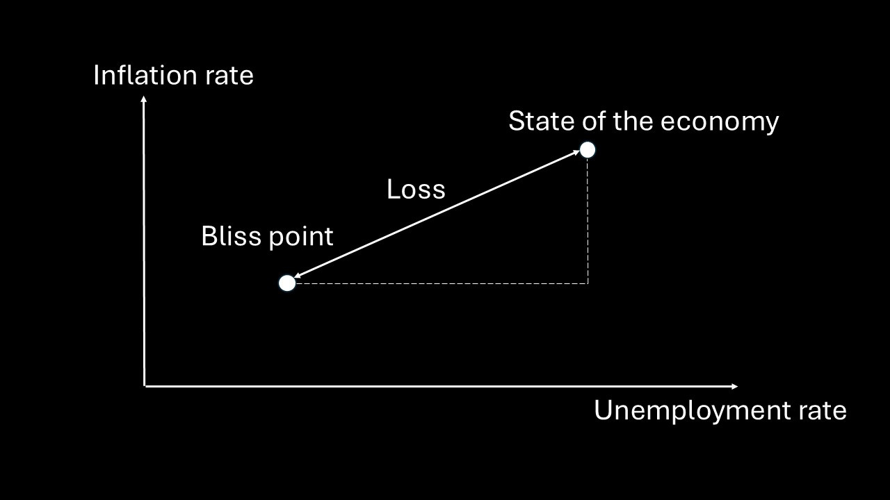
The distance from the current economic state to the bliss point offers a simple summary measure of overall performance. From the right-angled triangle drawn in the graph, that distance can be measured using Pythagoras’ theorem.
While not commonly used in central bank communication, this approach offers a straightforward way to evaluate how well the Fed manages to stabilise the economy by summarising deviations from both inflation and unemployment targets in a single loss measure:
Loss = √[(inflation – 2%)² + (unemployment – 4.2%)²]
The graph below shows these deviations, based on monthly data since 2009.2
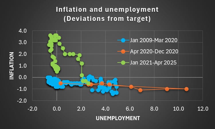
Source: FRED
The period from 2009 to 2020 is marked by blue dots, where most of the observed “loss” stemmed from elevated unemployment. The Global Financial Crisis pushed the unemployment rate to 10%, and it remained high for several years. Inflation, by contrast, was relatively well-behaved—typically a little below the 2% target.
The orange dots represent the early phase of the Covid-19 pandemic, from March to December 2020. During this time, unemployment spiked dramatically—peaking at 14.8% in April—while inflation fell further below target. However, the recovery in the labour market was unusually swift, reflecting both reopening effects and aggressive fiscal and monetary stimulus.
The situation reversed from January 2021 onward, as indicated by the green dots. With the economy reopening and demand rebounding strongly, inflation surged. Supply bottlenecks and sharp increases in energy prices, exacerbated by Russia’s invasion of Ukraine, played an important role. Yet unemployment continued to fall, even dipping below the Fed’s longer-run target. This unusual combination—above-target inflation and below-target unemployment—suggests that monetary policy was or had been too accommodative for too long.
The next graph shows the value of the loss function itself, tracking how far the economy was from the bliss point over time.
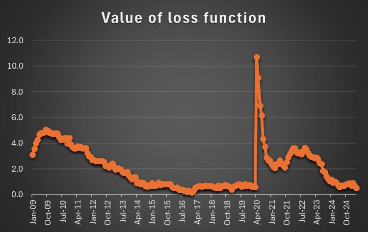
Source: My calculations
The pattern is clear. Between 2009 and 2020, deviations from the bliss point largely reflected weak labour markets. Since 2021, the driver of losses has been inflation. Encouragingly, the sharp fall in inflation over the past 18 months has brought the economy closer to the Fed’s dual objectives. Recent data suggest that the Fed has made steady progress in reducing the loss.
This measure highlights the Fed’s success in guiding the economy back toward balance. But monetary policy is always forward-looking. The real test lies not in where the economy has been, but in where it is going. Transmission lags are long and variable, and the economy remains exposed to renewed supply shocks, evolving fiscal conditions, and potential labour market softening. Steering toward the bliss point may yet require further course corrections.
The views expressed are my own. The work presented is preliminary and may contain errors. It should not be construed as investment advice. Readers are encouraged to seek professional investment guidance.
It has varied over time.
The data are available as series UNRATECTMLR on FRED. The monthly observations have been set equal to the quarterly data points in order to render the data monthly.