
Tracking Global Inflation
A cross-country approach to identifying turning points in inflation


Punchline: Global inflation data are noisy and hard to read. By averaging across countries instead of over time, we can better track shifts in global price pressures. Inflation fell sharply in March, rose gradually through mid-summer, and has been easing again since August — a pattern that traditional country-by-country analysis can easily miss.
Inflation is often hard to interpret. The CPI, the standard measure of inflation, is volatile. Prices of energy and food often fluctuate sharply in response to changes in global commodity markets, exchange rates, and harvest conditions. Other prices move with supply and demand, or with changes in taxes and tariffs.
Because of this volatility, monthly inflation rates fluctuate widely from one month to the next. To make sense of the data, analysts usually focus on annual inflation—the average monthly rate over the past year. This averaging smooths temporary swings and provides a clearer signal of price pressures.
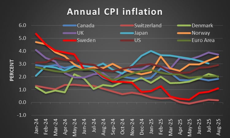
Source: BIS
The chart above shows annual inflation for nine advanced economies: Canada, Switzerland, Denmark, Great Britain, Japan, Norway, Sweden, the Euro Area, and the United States. This averaging makes it easier to see inflation trends across countries over time. Inflation was highest in Norway and the UK, and lowest in Switzerland and Sweden. However, it is not helpful for detecting turning points. Overall, annual inflation tells us much about average inflation levels, but it is less informative about what is happening at a particular moment in time.
A Cross-Country View
Here I take another perspective. Instead of averaging over time, I average seasonally adjusted monthly inflation rates across countries at each point in time. This approach better captures whether global inflation pressures are rising or falling at any given moment.
Since national inflation rates are strongly correlated, this approach is informative about global inflation pressures. The table below shows correlations of monthly inflation rates for the period 2000–2025. The last column reports each country’s average correlation with the others. These range from 0.53 in the Euro Area and 0.52 in the United States to 0.29 in Japan and 0.32 in Norway. For most other economies, they are around 0.45. All are statistically highly significant.
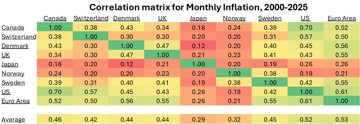
Source: My calculations on data from BIS
To reduce the impact of outliers, the graph below shows the median annualised monthly inflation rate across countries rather than the mean, although the two are very similar in this period. The chart also shows the interquartile range, indicating how much inflation differs between countries.
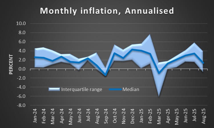
Source: My calculations on data from BIS
The picture that emerges is quite different from the one obtained when averaging over time. Rather than showing differences between economies in average inflation rates, it highlights global inflation pressures and how they shift at a point in time.
In 2025, global inflation was high in January and February but fell sharply in March. It then rose gradually through spring and summer, peaking in July before declining again in August. If global inflation continues to abate, central banks are likely to cut interest rates further.
Conclusion
By averaging across countries rather than over time, we gain a sharper picture of global inflation dynamics. This method helps cut through the noise of national data and captures common turning points that matter for both markets and central banks. While it does not replace country-level analysis, it offers a useful perspective on how global inflation pressures are evolving.
Thanks Stefan. Would you expect the US correlation with the ROW weaken overtime due to tariffs ?
Thank you Stefan for this analysis. Just to clarify: the median you’re showing is unweighted?